
Modal windows
Summary
- Principle.
- Core HTML base.
- ARIA roles, states and properties.
- Keyboard interactions.
- Expected behavior.
- Notes.
- Components.
Principle
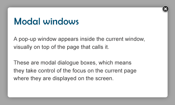
A modal window appears inside the current window, and is displayed above the page that calls it.
Modal windows take control of the current page as long as they are displayed on the screen.
This code is based on the “Modal window” design pattern found in the ARIA Authoring Practices Guide (APG) of the W3C.
Core HTML base
The HTML base of a modal window differs, depending on whether or not it has a title displayed on the screen.
Modal window with a title displayed on the screen
Modal window without a title displayed on the screen
ARIA roles, states and properties
role="dialog"must be applied to the container in the modal windowaria-modal="true"must be applied to the container in the modal window- If the title of the modal window is displayed on the screen, it must be attached to the modal window via the attribute
aria-labelledby:- The title of the modal window must have an
idattribute with a unique value. - The container of the modal window must have an
aria-labelledbyattribute with the value of theidattribute of the modal window title.
- The title of the modal window must have an
- If the title of the modal window is not displayed on screen,
aria-labelmust be applied and provided on the modal window container.
Keyboard interactions
Tab
When the modal window is displayed, this key moves the keyboard focus successively through the interactive elements in the modal window. If the focus is on the last interactive element in the modal window when the tab is pressed the keyboard focus moves to the first interactive element in the modal window.
Shift + Tab
This key combination has the same behavior as the Tab key, but in the reverse order. If the keyboard focus is on the first interactive element in the modal window when the key combination is pressed, the focus moves to the last interactive element in the modal window.
Esc
When the modal window is displayed, the modal window closes and the keyboard focus is placed on the interactive element that triggered the modal window.
Expected behavior
When the modal window is displayed (open)
- The keyboard focus is dynamically placed on the first interactive element contained in the modal window.
- The keyboard focus must be confined to the modal window and tabulating must not be possible on the rest of the page (below the modal window).
- The modal window can be closed with the Esc key.
When the modal window is hidden (closed)
- The keyboard focus must be repositioned on the element that opened the modal window opening.
- Ideally, the modal window is removed from the DOM. However, if the modal window remains present in the source code,
display: noneorvisibility: hiddenmust be applied to its container.
Components
These Modal window components are proposed here because their level of accessibility is considered good or very good.
However, before using them in your project, it is important to check that the specifications presented above have been respected. Certain components may need some adjustments before they can be used in your project.