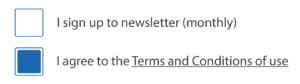
2.2. Make sure that there is sufficient contrast between informative and interactive graphic elements and the background
The contrast between informative and interactive graphic elements and the background must be sufficient.
It includes, in particular:
- Informative pictograms.
- Interactive pictograms alone, without label.
- Form fields.
- Tabs.
Minimum contrast ratio
The minimum contrast ratio to reach between the informative/interactive graphic elements and the background color is of 3.
Note
To test the contrast ratio, use, for example, the Colour Contrast Analyser tool.
![Print and text size magnification buttons, with a contrast ratio of 6:1](/wp-content/uploads/2015/06/contraste-05.jpg)
!["Walk" pictogram (dark gray) indicating 2 minutes and 111 meters, with a contrast ratio of 5.7:1](/wp-content/uploads/2018/01/images-04.jpg)
![2 checkboxes, with an outline and a checked state indicated in blue (#395CA6) on a white background. 6.5:1 contrast ratio](https://www.accede-web.com/wp-content/uploads/2021/01/cases-a-cocher-contraste-ok-300x84.png)
![Text input field, grey outline (#DDDDDD) on white background, contrast ratio 1.4:1](https://www.accede-web.com/wp-content/uploads/2021/01/champ-de-texte-sans-contraste-300x78.png)
![Same text input field, blue outline (#00689E) on white background, contrast ratio 6:1](https://www.accede-web.com/wp-content/uploads/2021/01/champ-de-texte-contraste-300x78.png)
Alternative style guidelines
If it is not practical to optimize the contrast, then sufficiently contrasted alternative style guidelines must be provided.