
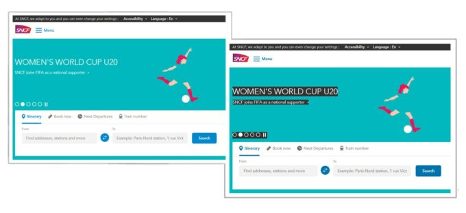
2.2. Make sure that there is sufficient contrast between the content and the background
The contrast between the text and the background must be sufficient.
This applies to all texts (“pure”, embedded in images, videos, etc.).
Minimum contrast ratio
The minimum contrast ratio required for text is 4.5 with the background colour.
Note
- The kind of font used has no impact on the contrast ratios to be reached.
- Text size and weight can allow for a lower contrast ratio to be acceptable, but we strongly recommend always meeting the 4.5 contrast ratio for text. For more information, refer to criterion 1.4.3 in WCAG.
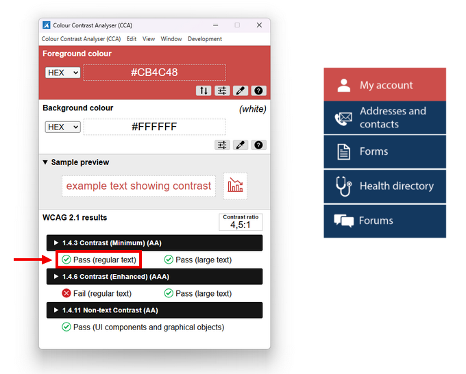
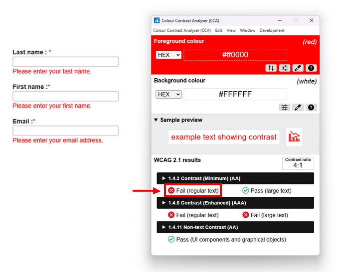
Colour Contrast Analyser
To test the contrast, you could use a tool such as Colour Contrast Analyser, which is freely available for Windows and MacOS.
This tool allows you to manually enter colors using their hexadecimal codes or select them using an eyedropper. Compliance results are displayed directly within the tool.
Warning
Be careful when using gradients, transparency and background images.
Tips
- The Chart contrast analysis grid allows you to automatically calculate the contrasts of several colours.
- The Contrast-Finder tool can be used to find sufficiently contrasted color combinations.
Alternative style guidelines
If it is not practical to optimize the contrast, then you can create alternative style guidelines that offer sufficient contrast.
Alternative style guidelines do not necessarily push the contrast to the limits (for example, black on white, or white on black), but provide rules so that the association of colours is optimized satisfactorily.
Comments
Leave a Reply
Updates
- 09 June 2022
- Removal of the “Find More” section
- 20 January 2026
- Update of the examples