
Customized tooltips
Summary
- Principle.
- Core HTML base.
- ARIA roles, states and properties.
- Keyboard interaction.
- Expected behavior.
- Notes.
Principle
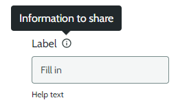
Tooltips are messages that allow the user to obtain additional information about an item. The message is displayed on hover and also when keyboard focus is on the button.
A tooltip is “customized” when it is not built using the standard HTML code as found in the specification, which is the title attribute.
Core HTML base
ARIA roles, states and properties
role="tooltip"must be applied to the tooltip container.- The container of the tooltip must have an
idattribute set to a unique value. - The button that triggers the tooltip must contain an
aria-describedbyattribute set to the value of theidattribute of the container for the tooltip. - Here, the button is made with an informative <svg> icon.
Keyboard interaction
Enter and Space
When the focus is positioned on the button that displays the tooltip, it shows or hides the tooltip.
Esc
When the tooltip is visible, this key hides the tooltip.
Expected behavior
- The tooltip must be displayed when the triggering button:
- Is hovered over by the mouse.
- Receives keyboard focus.
- The tooltip must be hidden when the triggering button:
- Is not hovered over.
- Does not have keyboard focus.
- Hitting the Esc key hides the tooltip.
- The tooltip must remain visible as long as the mouse is hovering over the triggering button.
- When the tooltip is hidden, only its content should be hidden (using
display: noneorvisibility: hiddenfor example). The tooltip container must remain present and visible in the HTML DOM.
Notes
- The major advantage of a custom tooltip over its standard HTML counterpart (
titleattribute) is that the custom tooltip is also accessible for keyboard users. - We strongly recommend the exclusive use of a button to display a tooltip, so that people navigating by fingertip on a phone can also display them.
Comments
Leave a Reply
Updates
- 27 October 2025
- Major update to the sheet, which now highlights the use of a button to display the tooltip, instead of a link.