
Tab panels
Summary
Principle
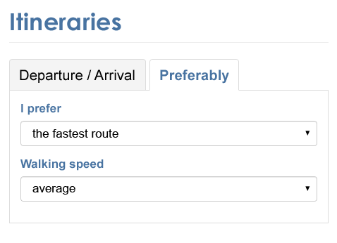
Tab panels are dynamic modules that optimize visible space on a web page, through a system of elements which control whether panels are visible or hidden.
They usually appear as a list of items placed next to the selected tab, designed to display content that relates to it. Only one tab can be activated at the time.
This code is based on the “Tabs with Automatic Activation” design pattern found in the ARIA Authoring Practices Guide (APG) of the W3C.
The source code and implementation examples for this component are available in this guide.
Core HTML base
ARIA roles, states and properties
- The
role="tablist"andaria-label="[Component title]"attributes must be applied to the element that encloses the tabs. If the component is already introduced by a visible title, replace thearia-labelattribute with anaria-labelledby="[id attribute value to be added to the component title]"attribute.If the tabs are oriented vertically, the
aria-orientation="vertical"attribute must also be applied. role="tab"must be placed on each tab.role="tabpanel"must be placed on each tab panel.- The
tabindex="0"attribute must be applied to each panel. - Each tab must be associated with its panel via the
aria-controlsattribute:- Each panel must have an
idattribute set to a unique value. - Each tab must have the
aria-controlsattribute set to the value of theidattribute of the associated panel.
- Each panel must have an
- Each panel must be associated with the tab that controls it via the
aria-labelledbyattribute:- Each tab must have an
idattribute set to a unique value. - Each panel must have an
aria-labelledbyattribute set to the value of theidattribute of the tab that controls it.
- Each tab must have an
- The
aria-selectedattribute must be applied to each tab. Its value must be set dynamically according to the state of the associated tab:aria-selected="true"on the selected tab.aria-selected="false"on the other tabs, which have not been selected.
- The
tabindex="-1"attribute must be placed on each non-selected tab. It must be set dynamically according to the state of the associated tab.
Keyboard interaction
Tab and Shift + Tab
When the user tabs into the tabbed interface component, the Tab key places the focus on the selected tab in the group. When the focus is on a tab, pressing the Tab key leaves the group of tabs and the focus is placed on the displayed panel.
Left arrow
When the focus is on a tab, this key moves the keyboard focus to the previous tab in the tabbed interface component and selects this tab. If the keyboard focus is on the first tab in the group, this key moves the keyboard focus to the last tab in the group and selects it.
If the tabs are oriented vertically, the Up arrow must also have this behavior.
Right arrow
When the focus is on a tab, this key moves the keyboard focus to the next tab in the tabbed interface component and selects this tab. If the keyboard focus is on the last tab in the group, this key will move keyboard focus to the first tab in the group and selects it.
If the tabs are oriented vertically, the Down arrow must also have this behavior.
Note
Panels not displayed must be hidden with display: none or visibility: hidden.
Comments
Leave a Reply
Updates
- 07 October 2025
- Addition of an accessible name to the tab container.