Radio buttons customized using CSS
Summary
Principle
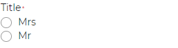
Radio buttons are form elements that allow the user to select a single option out of a group of possible options.
Radio buttons are “customized using CSS” when they are built using the standard HTML code for radio buttons as found in the specification <input type="radio" /> but the standard radio buttons are visually hidden and replaced with CSS images, icon fonts, or specific styles.
There are several ways of achieving this. The example below shows how to simulate the behavior of standard default HTML radio buttons using CSS pseudo-elements and background images, while ensuring that they remain accessible.
Core HTML base
<fieldset>
  <legend>Question</legend>

  <input type="radio" id="answer-1" name="question" value="answer-1" />
  <label for="answer-1">Answer 1</label>

  <input type="radio" id="answer-2" name="question" value="answer-2" />
  <label for="answer-2">Answer 2</label>

  […]
</fieldset>
CSS base
label {
  padding: 0 0 0 2rem;
  position: relative;
}

input[type=radio] {
  position: absolute;
  opacity: 0;
}

input[type=radio]   label::before,
input[type=radio]   label::after {
  content: '';
  position: absolute;
  border-radius: 50%;
}

input[type=radio]   label::before {
  left: 0.5rem;
  top: 0.2rem;
  display: inline-block;
  width: 0.8rem;
  height: 0.8rem;
  border: 0.05rem solid black;
  background: white;
}

input[type=radio]:checked   label::after {
  left: 0.67rem;
  top: 0.35rem;
  border: 0.25rem solid black;
}

input[type=radio]:focus   label::before {
    outline: 0.2rem solid;
    outline-offset: 0.2rem;
}
Demo
Comments
Updates
- 27 October 2025
- Minor update.
- 01 December 2025
- Addition of an illustration.
Back to top