
Hamburger menu
Summary
- Principle.
- Core HTML base.
- ARIA roles, states and properties.
- Keyboard interactions.
- Expected behaviour.
- Note.
Principle
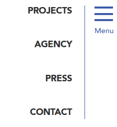
A hamburger menu generally takes the form of an icon button that displays a menu.
Core HTML base
ARIA roles, states and properties
- The
<nav role="navigation">tag must be used to structure the menu and the hamburger button. - The
aria-labelattribute must be included in the same<nav role="navigation">tag and set with the name of the corresponding menu (e.g.aria-label="Main menu"). - The hamburger button must be marked with a
<button>tag. - The
aria-expandedattribute must be applied to the hamburger button that controls the menu. Its value must be set dynamically according to the status of the menu:aria-expanded="true"when the menu is expanded.aria-expanded="false"when the menu is collapsed.
Keyboard interactions
Enter and Spacebar
When the keyboard focus is positioned on the hamburger button, alternately displays/hides the menu.
Esc
If the menu is displayed, close it and move the keyboard focus to the hamburger button.
Expected behaviour
- When the keyboard focus is positioned on the hamburger button, the menu can be displayed/hidden using the Spacebar and Enter keys. To do this, listen to the
clickevent. - When the menu is collapsed, it must be hidden using
display: none;orvisibility: hidden;. - The default
aria-expandedattribute value of the hamburger button must be modified dynamically each time the menu status changes.
Note
In the particular case where the hamburger button is not located immediately before the menu’s HTML code, it will be necessary to facilitate access to this menu:
- When the hamburger button is pressed, the focus is automatically moved to the menu:
- In the first menu item, if the menu is interactive,
- otherwise, in the menu container (by adding the
tabindex="-1"attribute to make it focusable).
- When the focus is in and out of the menu, it should be placed :
- At the hamburger button, after tabbing back from the first interactive menu item.
- At the next interactive element immediately after the hamburger button in the HTML code, after tabbing forward following the last interactive element in the menu.
- When the menu is open, use the Escape shortcut to close it, repositioning the focus on the hamburger button.
- Associate the hamburger button with its menu via the
aria-controlsattribute:- The menu must have an
idattribute with a unique value. - The hamburger button must have an
aria-controlsattribute set to the value of the menuidattribute.
- The menu must have an
6 comments
-
Ce commentaire a été publié il y a plus de 2 ans. Il se peut que son contenu ne soit plus d'actualité.
Thanks for creating these guidelines, they’re a great reference.
There’s several details you don’t mention here that I’m unsure about:
– When Esc is pressed to close the menu, should you not set the focus back to the menu button?
– When the menu is open, shouldn’t it be treated as a modal, where keyboard navigation will be restricted to only the menu?-
Ce commentaire a été publié il y a plus de 2 ans. Il se peut que son contenu ne soit plus d'actualité.
Hello Travis,
Thank you for your message!
Concerning the Esc shortcut, I believe that the answer to your question is in the “Keyboard interactions” of the guidelines: If the keyboard focus is positioned on one of the menu items, Esc moves the keyboard focus to the hamburger button that triggered the menu display, and then closes it.
Concerning the modal behavior, it will depend on the visual menu opening: if it prevents user from accessing the rest of the page content (the menu opening takes all the screen for example), it could be considered as a modal. If not, a simple disclosure button can make it, without keyboard navigation restriction.
I hope this is clearer for you.
Have a good day,
Romain
-
-
Ce commentaire a été publié il y a plus de 2 ans. Il se peut que son contenu ne soit plus d'actualité.
According to W3C Recommendations the adding of role=”navigation” is allowed, but not recommended. See: https://www.w3.org/TR/html-aria/#el-nav
-
Ce commentaire a été publié il y a plus de 2 ans. Il se peut que son contenu ne soit plus d'actualité.
Hello Steffi,
Thank you for your comment.
The information is a duplicate of the nav tag to ensure a correct restitution by the screen readers. The W3C says it is not recommended, because it follows the first ARIA rule.
But in this case, there are only benefits to adding this role.
The goal here is to make the information accessible to the largest number of users, especially those who do not have access to the latest versions of screen readers, which may not render the information without this attribute.Adding the role=”navigation” (and other landmark tags) is also to be compliant with French accessibility standards (RGAA).
Regards,
Romain
-
-
Ce commentaire a été publié il y a plus de 2 ans. Il se peut que son contenu ne soit plus d'actualité.
Do we still need to put `role=”navigation”` in the since it’s nag tag and it’s not just a div tag
-
Ce commentaire a été publié il y a plus de 2 ans. Il se peut que son contenu ne soit plus d'actualité.
Hello,
Thank you for your message.
I confirm that the
role="navigation"attribute is still needed here.The information is duplicated to ensure a correct restitution by the screen readers.
The goal here is to make the information accessible to the largest number of users, especially those who do not have access to the latest versions of screen readers, which may not render the information without this attribute.
Regards,
Romain
-
Leave a Reply
Updates
- 27 October 2025
- Minor update.